COASTAL DESIGN SCHOOL
How to Layer Blue Without Overwhelming a Room:
Lessons From New England Coastal Homes
____________________
Blue is a coastal classic, but the secret to using it well is restraint. The most timeless New England homes layer it alongside warm neutrals, natural materials, and texture, allowing the color to quietly elevate a room rather than define it.
SEPTEMBER 7, 2026
BY: MARIA CEBAN


ON THIS PAGE:
Introduction
Why Blue Has Become a Coastal Design Classic
A Common Mistake When Decorating With Blue
Understanding Blue Through Color Theory: Warm Blues
Understanding Blue Through Color Theory: Cool Blues
Think in Layers, Not a Single Shade
Pair Blue With Warm Natural Materials
How New England Coastal Homes Use Blue: Living Rooms
How New England Coastal Homes Use Blue: Kitchens
How New England Coastal Homes Use Blue: Bedrooms
How New England Coastal Homes Use Blue: Bathrooms
How New England Coastal Homes Use Blue: Patios
Architect’s Perspective: Let Nature Be Your Guide
The Bottom Line: The Art of Restraint
Blue has long been synonymous with New England coastal design. It’s the color of the ocean, the sky, and perhaps most famously, the hydrangeas that bloom across every New England town each summer.
Despite its popularity, blue can be surprisingly tricky to use well in interior design. Too much blue can leave a room feeling cold; the wrong shade can feel overly nautical, or dark and stormy. And when every surface competes for attention, even the most beautiful color can start to feel overwhelming.
The secret to a successful use of color blue, though, isn’t using less of it—it’s using it more thoughtfully.
The most beautiful New England coastal homes seem to understand this instinctively. Rather than treating blue as the star of the show, they let it serve as one gentle layer within a broader palette of natural materials, soft neutrals, and carefully considered textures. The result feels timeless, elegant, and remarkably livable.
If you’ve ever wondered how to decorate with blue without letting it take over a room, this edition of Salt & Still’s Coastal Design School gathers a few lessons from classic New England coastal homes and offers a practical, thoughtful approach to decorating timelessly.
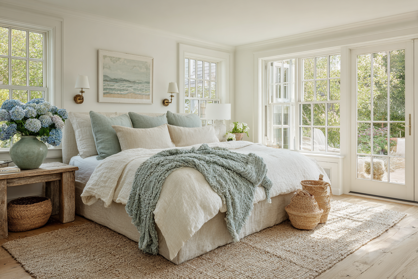
Rather than treating blue as the star of the show, timeless New England coastal homes let it serve as one gentle layer within a broader palette of natural materials, soft neutrals, and carefully considered textures.
01 ———–
Why Blue Has Become a Coastal Design Classic
Unlike trend-driven colors that cycle in and out of popularity, blue has remained a design staple for centuries; hence it feels familiar, calming, and connected to the natural world.
Part of blue’s appeal comes from psychology. Studies have long suggested that blue is associated with calmness, stability, and relaxation—qualities many homeowners hope to bring into their living spaces.
New England coastal homes rarely rely on bold, saturated, or overly dark blues to achieve this effect. Instead, they draw inspiration directly from the landscape. Imagine:
- Misty morning skies.
- Weathered harbor cottages.
- Sea glass softened by the tide.
- Hydrangea blooms.
- Deep Atlantic waters.
These natural references create a layered, familiar, and authentic palette, rather than a themed one.
02 ———–
A Common Mistake When Decorating With Blue
One of the most common misconceptions is that a coastal room should include as much blue as possible, all in the same tone and shade. In reality, the opposite is often true.
Many homeowners choose a single shade of blue and repeat it throughout a room, in the walls, furniture, pillows, artwork, and accessories. While easier to work with, this approach can quickly make a space feel flat and overly coordinated.
The most successful coastal interiors treat blue as an accent, not a requirement. Blue should support the room, not dominate it. Think of blue as one voice in a conversation rather than the only voice being heard.
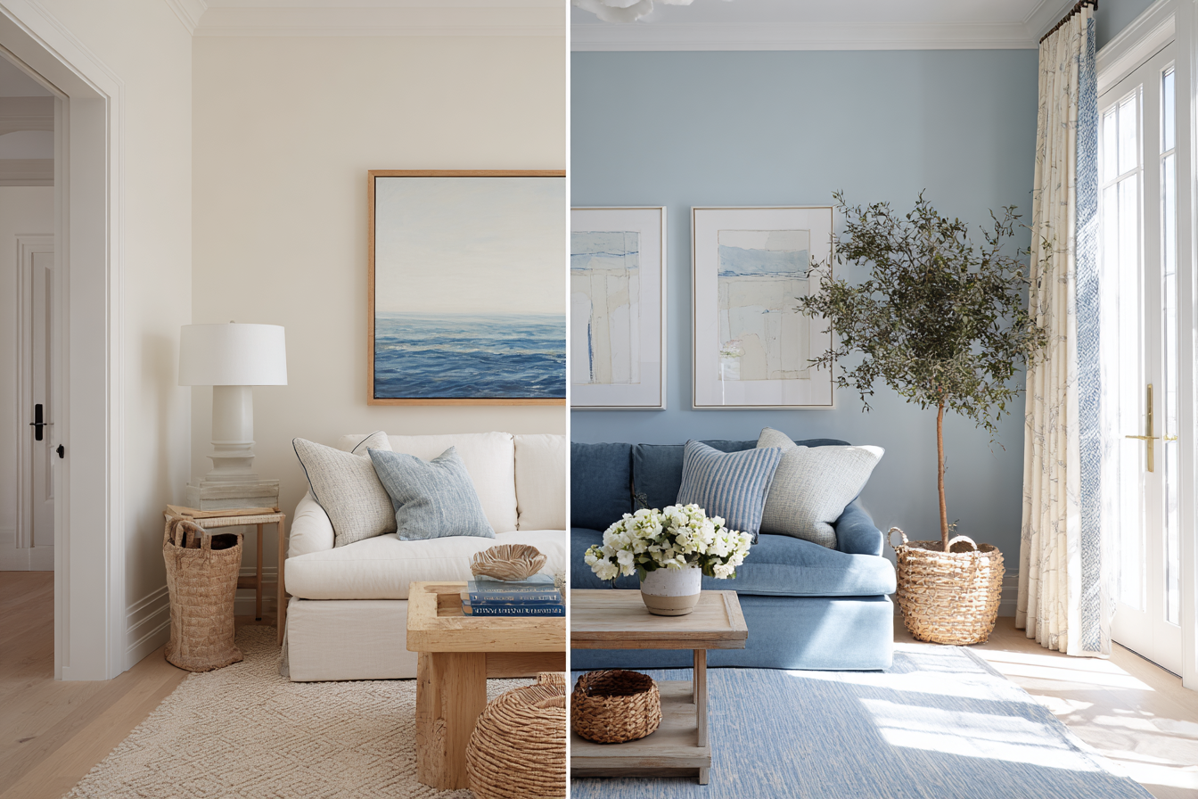
Choosing a single shade of blue and repeatedly using it throughout the room may make a space feel flat and overly coordinated. The most successful coastal interiors treat blue as an accent rather than a requirement.
03 ———–
Understanding Blue Through Color Theory: Warm Blues
Not all blues are equal, in terms of not only the shade but also the undertones. Some blues contain gray, green, or violet undertones that dramatically affect how they feel in a space. Warm blues tend to feel softer and more relaxed, as they derive their color tone from the outdoors.
Warm blues include:
- Gray-blue tones.
- Green-blue tones.
- Dusty coastal blues.
Classic paint suggestions:
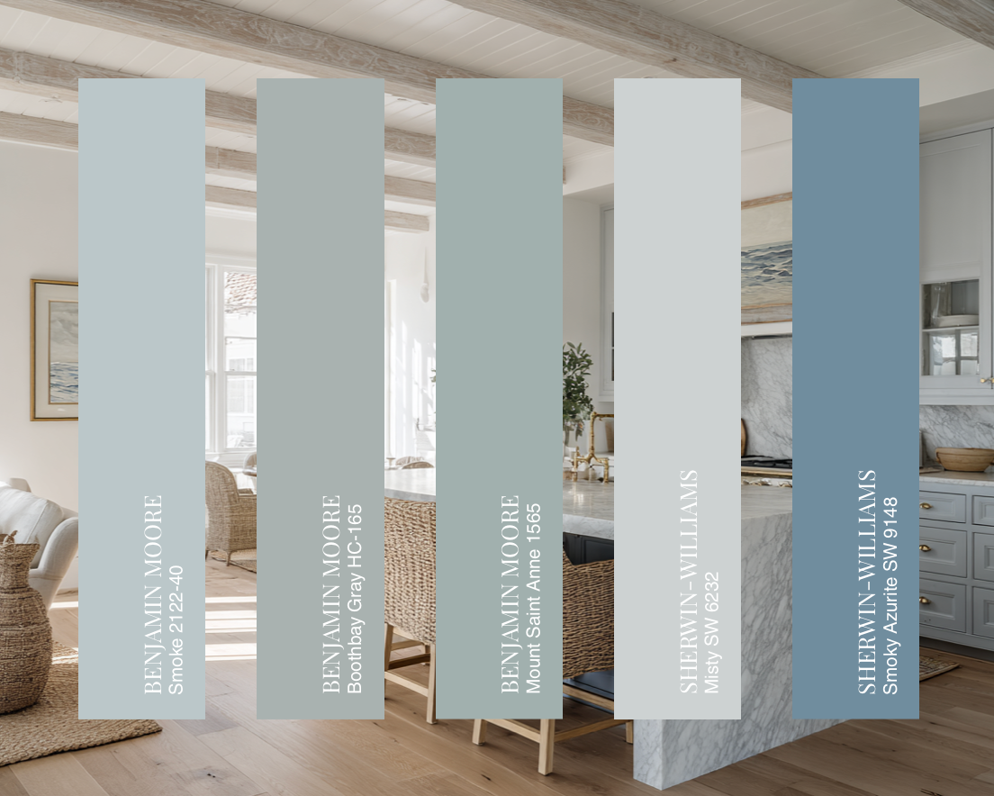
- Benjamin Moore Smoke 2122-40. A muted blue-green with soft gray undertones. One of the best examples of a timeless coastal blue.
- Benjamin Moore Boothbay Gray HC-165. A beautiful blue-gray that changes throughout the day. Calm and architectural.
- Benjamin Moore Mount Saint Anne 1565. A classic dusty blue that feels historic rather than trendy.
- Sherwin-Williams Misty SW 6232. A pale gray-blue that’s incredibly versatile and airy.
- Sherwin-Williams Smoky Azurite SW 9148. A sophisticated muted blue with enough gray to stay soft and elegant.
04 ———–
Understanding Blue Through Color Theory: Cool Blues
Unlike their nature-inspired, warm counterparts, cool blues can feel more energetic but may become overwhelming if used excessively. For a timeless New England coastal look, softer blues with muted undertones are often the safest choice.
Cool blues include:
- Bright royal blues.
- Crisp icy blues.
- Highly saturated navy tones.
Classic paint suggestions:
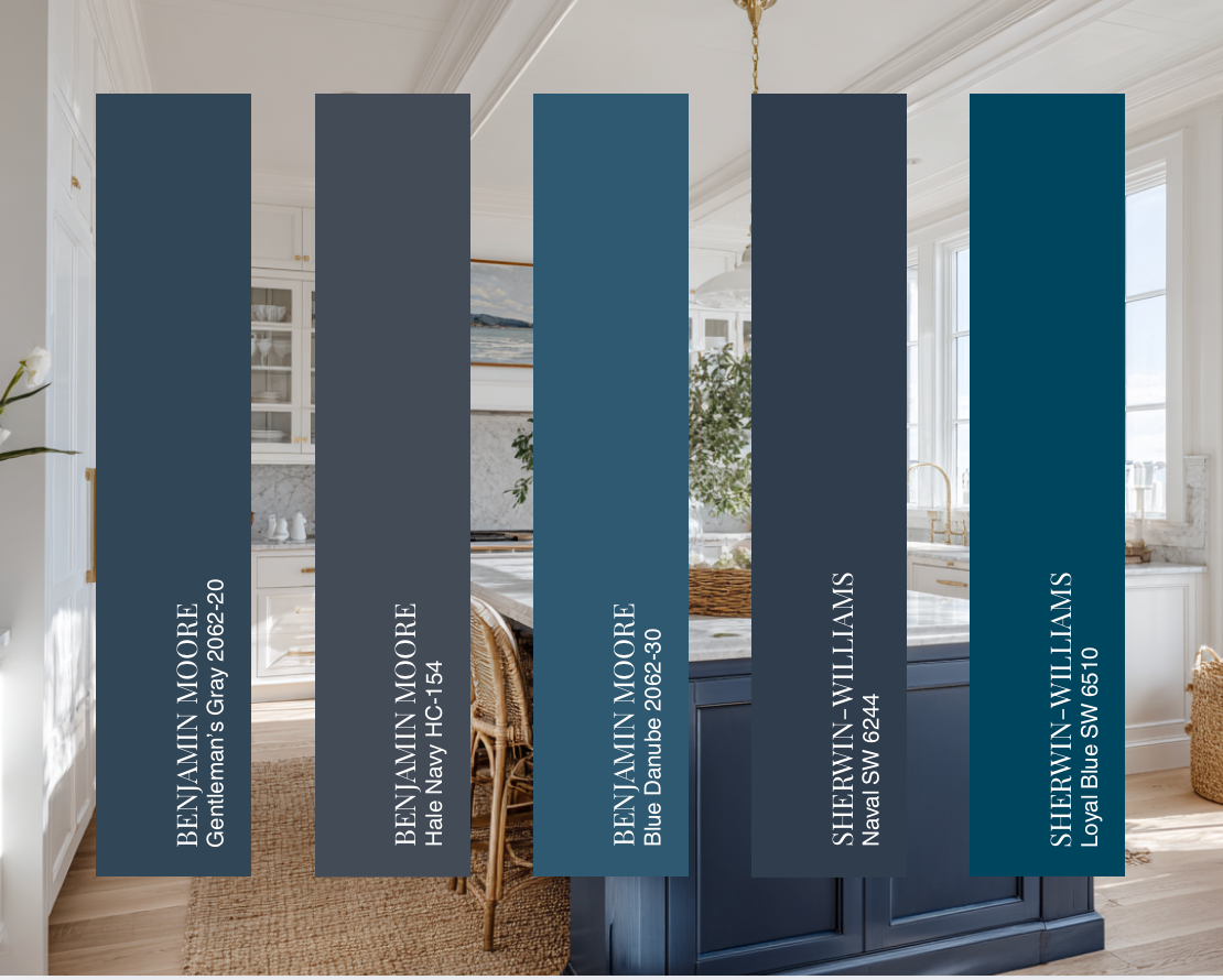
- Benjamin Moore Gentleman’s Gray 2062-20. A rich blue that can read cool and dramatic, especially in northern light.
- Benjamin Moore Hale Navy HC-154. A saturated navy that creates striking contrast. Beautiful in moderation.
- Benjamin Moore Blue Danube 2062-30. A vivid blue that’s energetic and unmistakably cool.
- Sherwin-Williams Naval SW 6244. One of Sherwin-Williams’ most iconic deep blues. Sophisticated but bold.
- Sherwin-Williams Loyal Blue SW 6510. A brighter, more traditional blue with noticeable saturation.
05 ———–
Think in Layers, Not a Single Shade
One of the hallmarks of thoughtful, timeless, and collected interior design is variation of colors, shades, and patterns. Rather than choosing one blue and repeating it endlessly, layer multiple shades throughout the room and pair them with other colors and textures. A room filled with blue can feel one-dimensional, whereas a room layered with blue and natural materials feels sophisticated.
Layering of blue may look like this: a pale blue-gray wall color, mid-tone blue textiles, navy accents, blue artwork, and hydrangeas in varying shades of blue, either outside the window or indoors in vases. This creates depth and visual interest while maintaining cohesion, all because nature rarely uses a single shade of blue, so your home shouldn’t either.
Perhaps the most important lesson from New England coastal homes is that blue rarely stands alone, even after being layered in a space. Instead, it is grounded by a neutral foundation.
In addition to layering the blue, consider creating a soft, neutral backdrop: soft white walls, warm cream upholstery, linen fabrics, white oak furniture, natural stone, and woven textures. These elements create breathing room for blue to shine without overwhelming the space. In fact, many coastal interiors contain far more neutrals than blue. This balance is what gives them their timeless appeal.
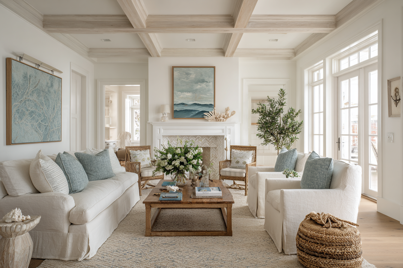
In a successful New England coastal home, blue rarely stands alone. Instead, it is grounded by a neutral foundation. This way, blue gets to shine without overwhelming the space.
06 ———–
Pair Blue With Warm Natural Materials
One of the reasons blue-filled rooms may feel cold is that they lack warmth elsewhere. New England coastal interiors solve this problem by pairing blue with natural materials and textures that add dimensionality and warmth.
When designing your space, consider adding these materials:
- White oak. Its warmth beautifully offsets cooler blue tones.
- Linen. Soft linen upholstery introduces texture and softness while maintaining an airy feel.
- Brass. Aged brass adds warmth and elegance without feeling formal.
- Natural stone. Marble, soapstone, and limestone create visual balance while adding timeless character.
- Woven materials. Rattan, wicker, and seagrass introduce organic texture that helps prevent a room from feeling overly polished.
When blue is paired with these materials, it feels relaxed and warm rather than rigid.
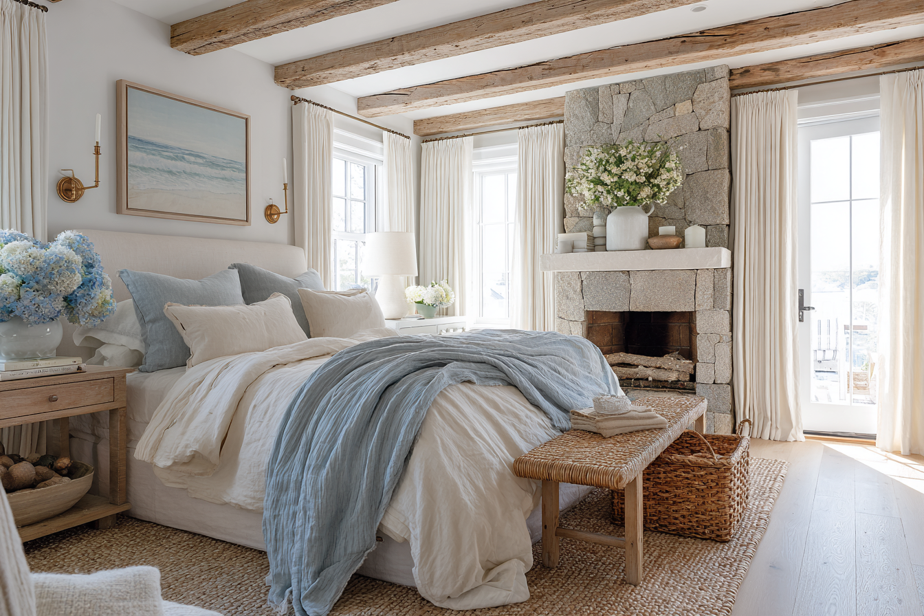
New England coastal interiors pair blue with materials that add texture and warmth, such as white oak, linen, brass, and others.
07 ———–
How New England Coastal Homes Use Blue: Living Rooms
Living rooms often provide the best example of color and texture layering. In many timeless New England coastal living rooms, the largest pieces of furniture, decor, and textiles, such as sofas, rugs, window treatments, and case goods, remain neutral in color. They create a perfect backdrop for accent colors and textures.
Blue is then introduced through smaller, punchy moves and layers. You might begin to see patterned pillows, blue artwork, decorative books, chunky textured throws, and various ceramic accessories.
This approach allows blue to add personality without dominating the room. It also provides flexibility for design changes as times of the year, styles, and personal design preferences evolve.
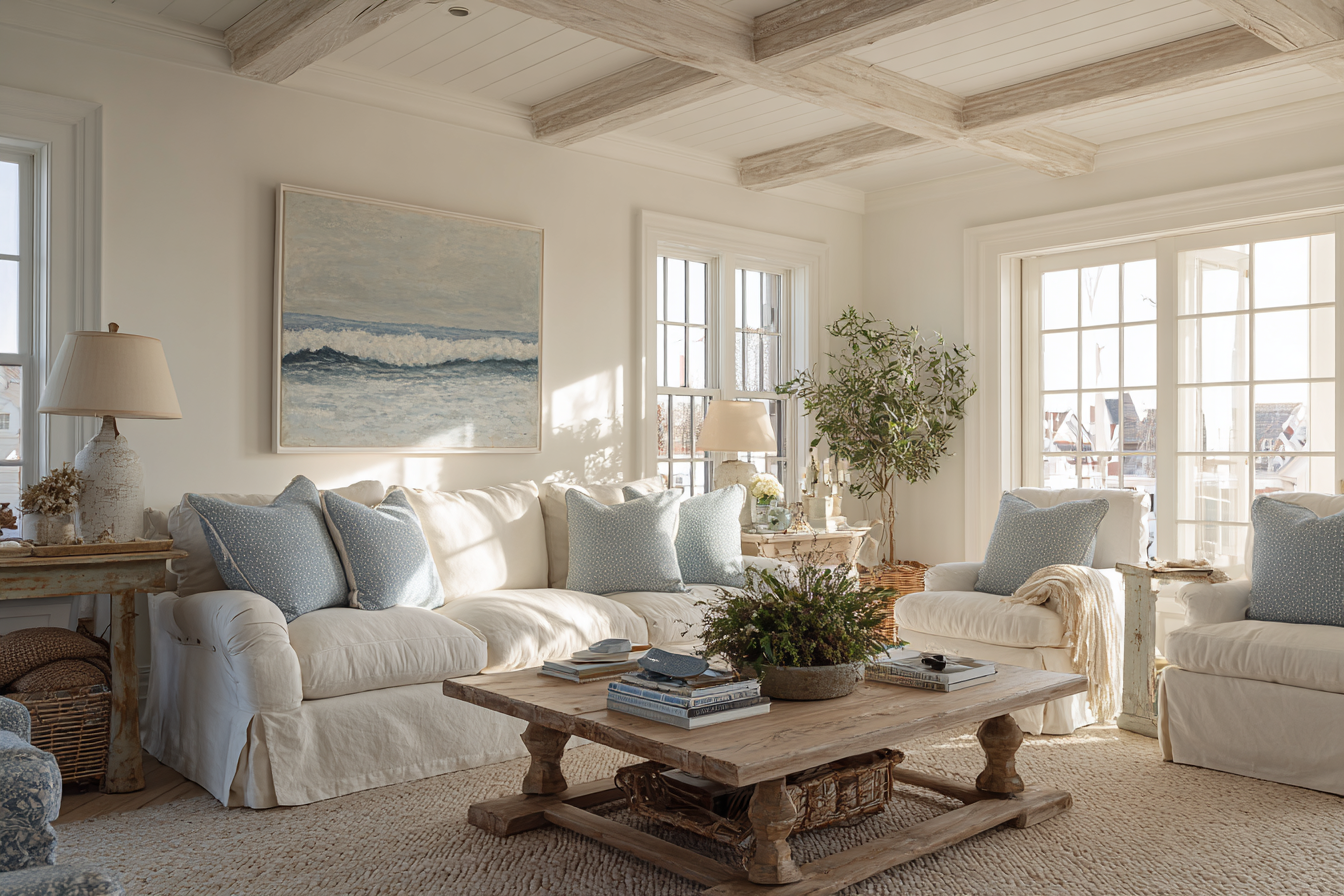
In many timeless New England coastal living rooms, the largest pieces of furniture, decor, and textiles, such as sofas, rugs, window treatments, and case goods, remain neutral in color. They create a perfect backdrop for accent colors and textures.
08 ———–
How New England Coastal Homes Use Blue: Kitchens
Similar to the living rooms, the most successful coastal kitchens rarely rely on an all-blue palette. Instead, blue often appears in measured doses.
Popular applications of the color blue include kitchen islands, bar stools, dishware displays, lighting accents, and textiles. Meanwhile, cabinetry, countertops, and walls often remain neutral in color.
This balance prevents the kitchen from feeling tied to a specific trend or time while still embracing coastal character.
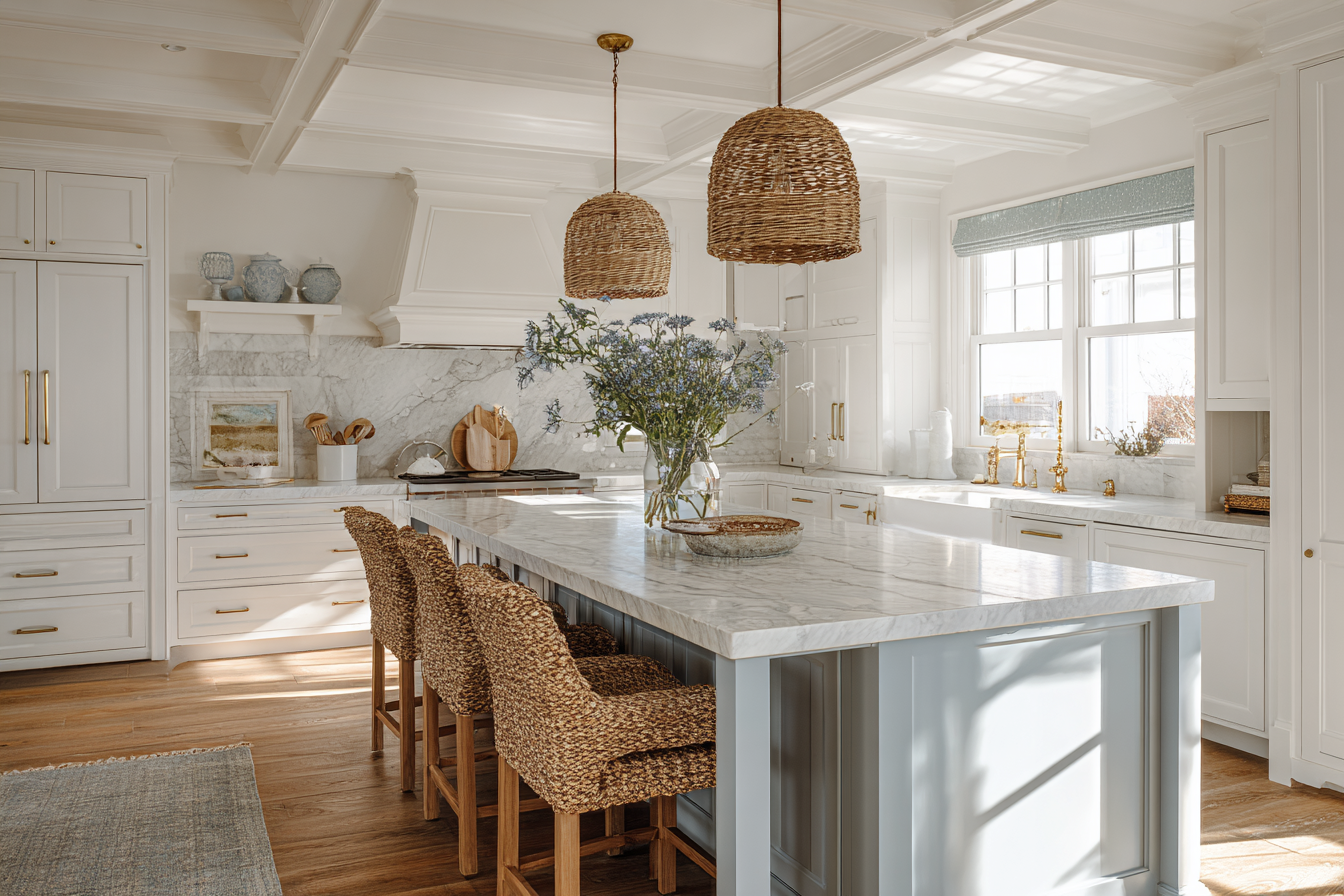
The most timeless coastal kitchens rarely rely on an all-blue palette. Instead, blue is introduced as an accent color among neutral settings, for example, in kitchen islands, ceramics, window treatments, etc.
09 ———–
How New England Coastal Homes Use Blue: Bedrooms
Bedrooms are naturally suited to the warm color blue because of its calming qualities. However, even in this case, restraint is important. A soft blue-gray wall color paired with white bedding, natural wood furniture, and subtle blue accents often feels more sophisticated than a room saturated in blue from floor to ceiling.
Layering of this color works particularly well through bedding, accent pillows, upholstered headboards, artwork, and window treatments.
The goal is serenity rather than saturation. Layering which creates visual comfort, rather than perfection.
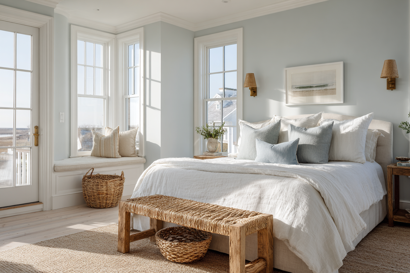
In bedrooms, a soft blue-gray wall color paired with white bedding, natural wood furniture, and subtle blue accents often feels more sophisticated than a room saturated in blue from floor to ceiling.
10 ———–
How New England Coastal Homes Use Blue: Bathrooms
Bathrooms offer an opportunity to embrace blue in slightly larger doses than other spaces. People naturally spend less time here than in other parts of their homes, which opens up an opportunity for bolder color and texture moves that will leave a quicker impression.
A blue vanity, blue-gray paint color, or subtle tile selection can create a coastal atmosphere without overwhelming a smaller space. Because bathrooms often feature white fixtures and natural stone surfaces, blue naturally feels balanced within the overall composition. Consider pairing them with brass for an ultimate sophisticated appearance. The result is fresh, timeless, and quietly elegant.
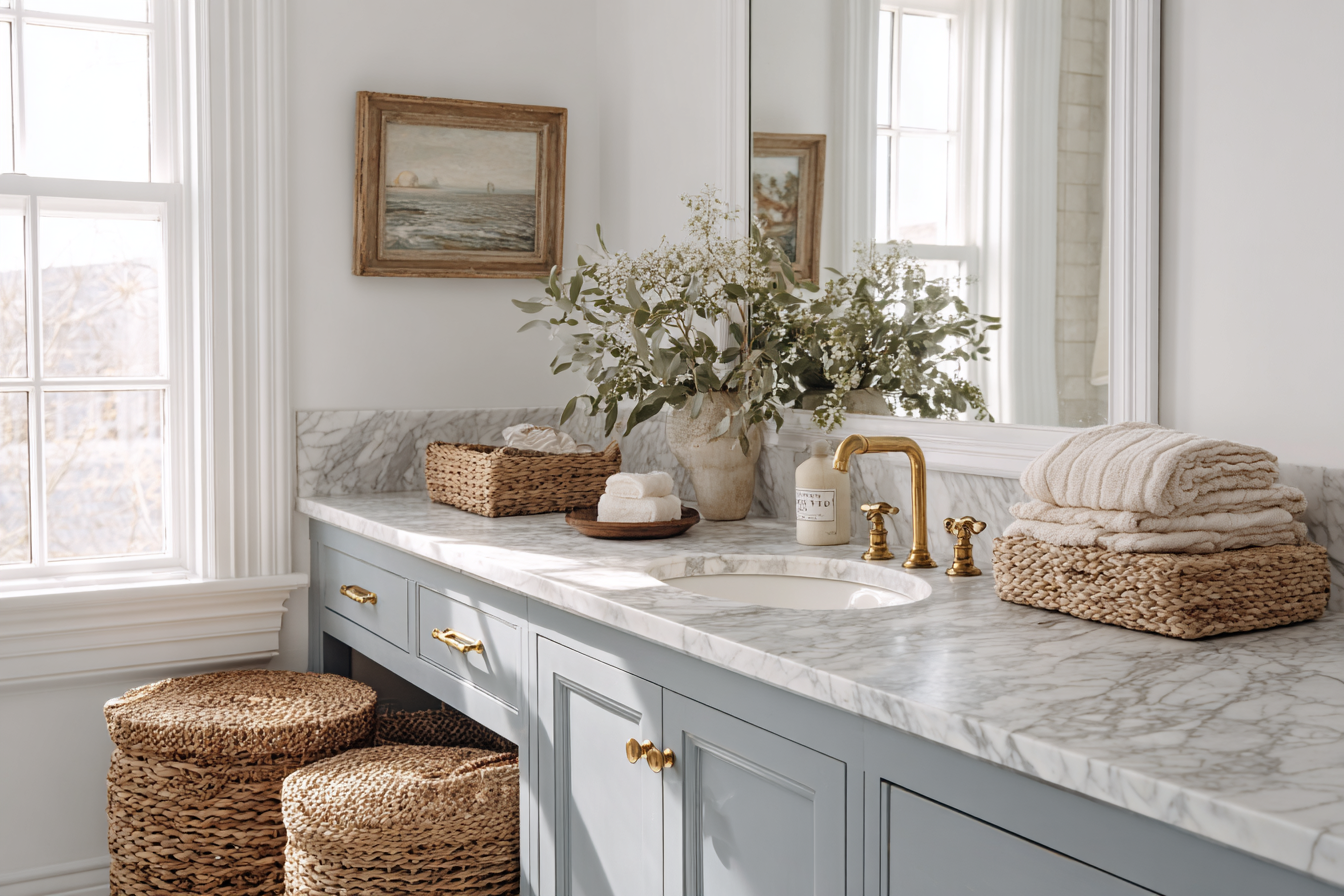
A blue vanity, blue-gray paint color, or subtle tile selection can create a coastal atmosphere without overwhelming a smaller space. The result is fresh, timeless, and quietly elegant.
11 ———–
How New England Coastal Homes Use Blue: Patios
Traditional New England coastal homes often extend their color palette beyond the interior, connecting architecture, interior design, and landscape. On porches and outdoor living spaces, blue may appear through outdoor cushions, painted ceilings, planters, hydrangea and other flower gardens, and decorative accessories.
The beauty of using warm blue outdoors is that it feels directly connected to the surrounding landscape. Here, blue becomes part of the environment rather than simply a design choice. It elevates both the surroundings and the outdoor space itself.
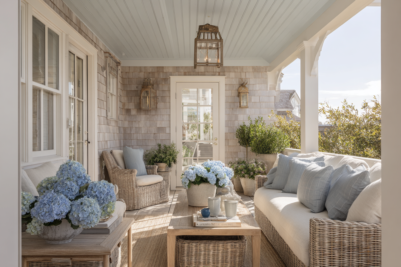
The beauty of using blue outdoors is that it feels directly connected to the surrounding landscape. Here, blue becomes part of the environment rather than simply a design choice.
12 ———–
Architect’s Perspective: Let Nature Be Your Guide
Even such a timeless and classic color as blue may begin to feel heavy, overused, and out-of-place when used incorrectly. The common mistakes to avoid include:
- Using the same shade everywhere. Variation creates depth. Repetition creates monotony.
- Pairing blue only with stark white. While blue and white are classic, introducing warmer neutrals often creates a more sophisticated result.
- Ignoring natural materials. Blue needs the warmth of wood, linen, stone, and woven textures to feel balanced.
- Going too nautical. Anchors, ropes, signs, and overt beach references can quickly date a space.
- Choosing highly saturated blues throughout. Bold colors can be beautiful, but moderation is key.
Because the most timeless coastal interiors often rely on muted and layered shades rather than bright statement colors, when choosing your palette, let nature be your guide.
A coastal landscape rarely consists entirely of blue. Instead, blue exists alongside sand-colored neutrals, green foliage, weathered wood, white clouds, and natural stone. This balance is precisely what makes coastal scenery so beautiful, and the same principle applies indoors.
When designing a room, think less about creating a “blue room” and more about creating a room inspired by your sightings of the coast.
13 ———–
The Bottom Line: The Art of Restraint
The most beautiful New England coastal homes don’t use more blue than everyone else; instead, they use it more thoughtfully.
By layering multiple shades, building upon a neutral foundation, incorporating warm natural materials, and drawing inspiration from the surrounding landscape itself, these homes create interiors that feel calm, elegant, and timeless.
In many ways, decorating with blue is an exercise in restraint. It isn’t about covering every surface in your favorite color. It’s about allowing blue to weave quietly throughout a space—appearing in the details, softening the palette, and creating a connection to the coast without overwhelming the room.
Because when blue is layered thoughtfully, it doesn’t dominate a space. It elevates it.